5.1.1.1 Endnote
KatyBorner.enw |
|
Time frame: | 1992-2010 |
Region(s): | Indiana University, University of Technology in Leipzig, University of Freiburg, University of Bielefeld |
Topical Area(s): | Network Science, Library and Information Science, Informatics and Computing, Statistics, Cyberinfrastructure, Information Visualization, Cognitive Science, Biocomplexity |
Analysis Type(s): | Co-Authorship Network |
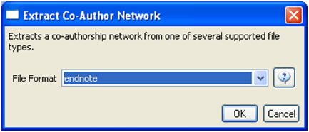
Many researchers, tools, and online services use EndNote to organize their bibliographies. To analyze an individual researcher's collaboration and publication profile, load an EndNote file which includes the researcher's entire CV into the Sci2 Tool. To generate a research profile for Katy Börner, load Katy Börner's EndNote CV at 'yoursci2directory/sampledata/scientometrics/endnote/KatyBorner.enw' (if the file is not in the sample data directory it can be downloaded from 2.5 Sample Datasets). Then run 'Data Preparation > Extract Co-Author Network' using the parameter:

After generating Dr. Börner's co-authorship network, run 'Analysis > Networks > Unweighted & Undirected > Node Degree' to append degree information to each node. To visualize the network, run 'Visualization > Networks > GUESS' and select 'GEM' in the Layout menu once the graph is fully loaded.. The resulting network in Figure 5.1 was modified using the following workflow:
- Resize Linear > Nodes > totaldegree > From: 5 To: 30 > Do Resize Linear (Note: total degree is the number of papers)
- Resize Linear > Edges > weight From: 1 To: 10 > Do Resize Linear (Note: weight is the number of co-authored papers)
- Colorize > Nodes > totaldegree From :
 To:
To:  > Do Colorize
 - Colorize > Edges > weight From:
 To: > Do Colorize
 - Object: nodes based on -> > Property: totaldegree > Operator: >= > Value: 10 > Show Label
- Type in Interpreter:
>for n in g.nodes:
     n.strokecolor = n.color
Note: The Interpreter tab will have '>>>' as a prompt for these commands. It is not necessary to type '>" at the beginning of the line. You should type each line individually and press "Enter" to submit the commands to the Interpreter. After typing the first line you will need to type the "Tab" key to indent the next line of code. For more information, refer to the GUESS tutorial at http://nwb.cns.iu.edu/Docs/GettingStartedGUESSNWB.pdf. The largest cluster in the network is outlined in black, and represents one single paper with many authors.

Figure 5.1: Co-authorship network of Katy Börner
GUESS supports the repositioning of selected nodes. Multiple nodes can be selected by holding down the 'Shift' key and dragging a box around specific nodes. The final network can be saved via 'GUESS: File > Export Image' and opened in a graphic design program to add a title and legend. The image above was created using Adobe Photoshop. Node clusters were highlighted and increased in size, the label font size was increased for emphasis, and a legend was added to clarify the significance of node and edge size and color.
To see the log file from this workflow save the 5.1.1.1 Endnote log file.
5.1.1.1.1 Using Cytoscape to Visualize Networks
Extended Version
This workflow uses the extended version of the Sci2 Tool. To know how to extend Sci2 view Section 3.2 Additional Plugins.
Cytoscape (http://www.cytoscape.org) is an open source software platform for visualizing networks and integrating these with any type of attribute data. Although Cytoscape was originally designed for biological research, now it is a general platform for network analysis and visualization. A variety of layout algorithms are available, including cyclic, tree, force-directed, edge-weight, and yFiles Organic layouts.
Cytoscape is available as a plugin in the extended version of the Sci2 Tool. To visualize networks in Sci2 using Cystoscape, first you have to extend the Sci2 Tool according to the directions at Section 3.2 Additional Plugins.
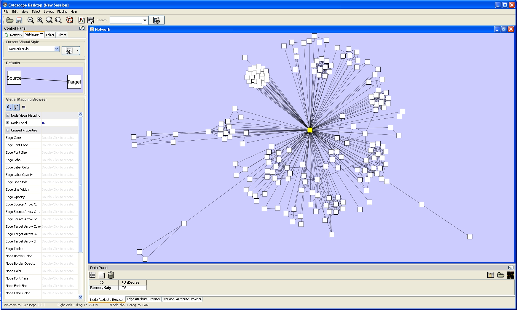
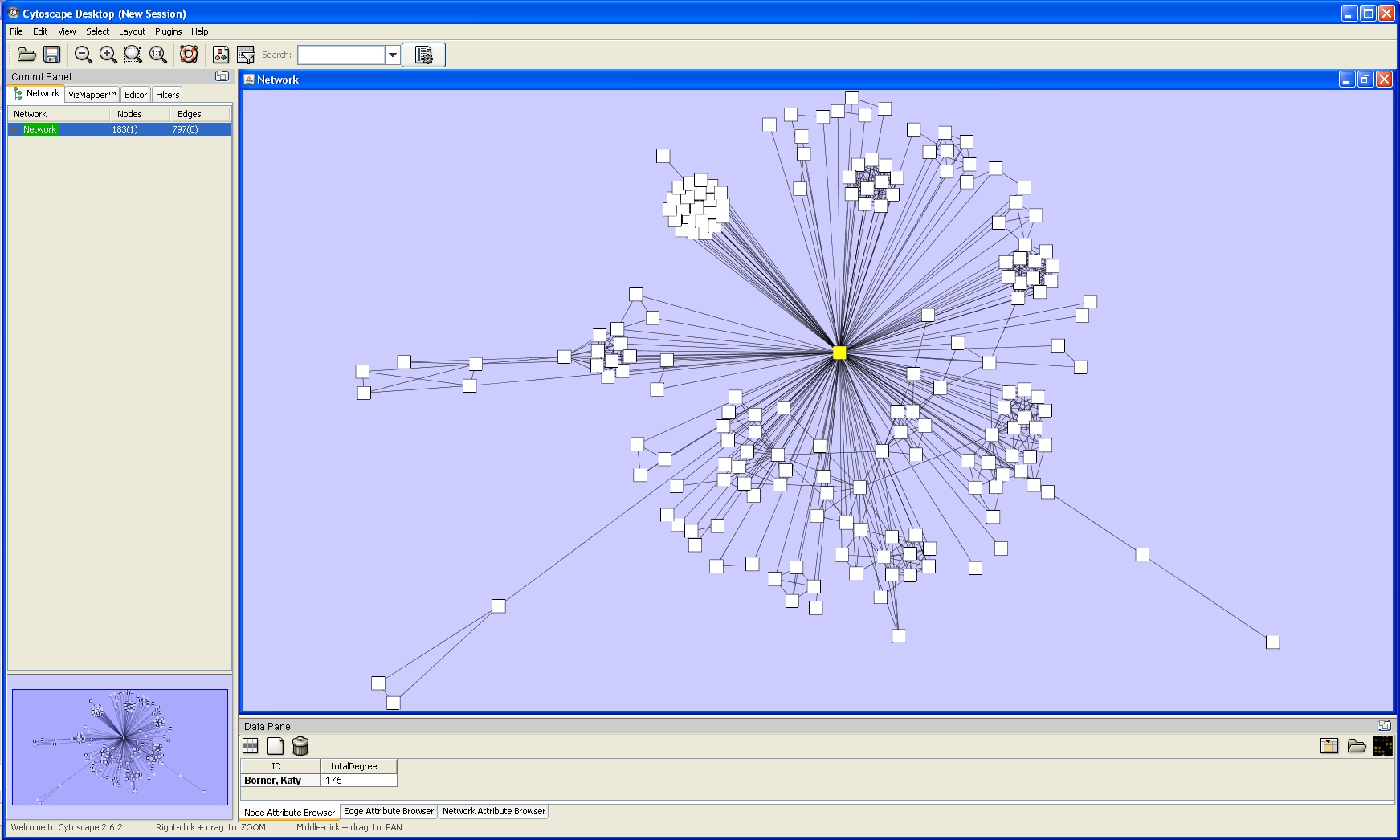
To exemplify how to use Cytoscape to visualize Networks, let's use Dr. Börner's co-authorship network generated above. To visualize this network, run 'Visualization > Networks > Cytoscape'.
In Cytoscape, the Layout menu has an array of features for organizing the network visually according to one of several algorithms, aligning and rotating groups of nodes, and adjusting the size of the network.
For example, run 'Layout > Cytoscape Layouts > Degree Sorted Circle Layout' once the network is fully loaded. This layout algorithm sort nodes in a circle by degree of the nodes. When the layout for the network finishes, Cytoscape will look similar to the image below:

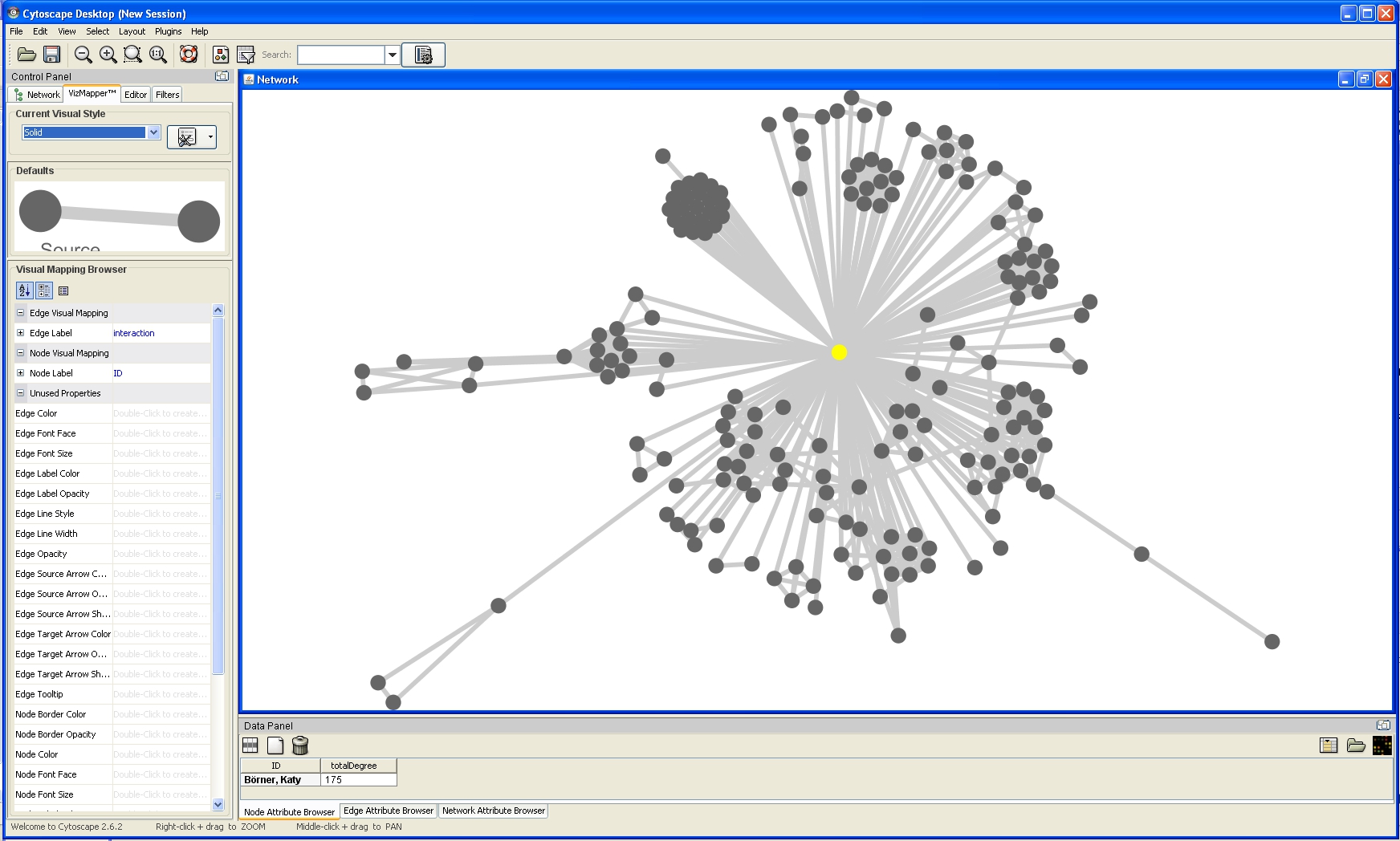
Now, run 'Layout > Cytoscape Layouts > Spring Embedded'. This spring-embedded layout is based on a "force-directed" paradigm as implemented by Kamada and Kawai (1988). Network nodes are treated like physical objects that repel each other, such as electrons. The connections between nodes are treated like metal springs attached to the pair of nodes. These springs repel or attract their end points according to a force function. The layout algorithm sets the positions of the nodes in a way that minimizes the sum of forces in the network. To see a description of all layouts and functionalities available in Cystoscape see Cytoscape User Manual.

The main window of Cytoscape has several components:
- The menu bar at the top
- The toolbar, which contains icons for commonly used functions. These functions are also available via the menus. Hover the mouse pointer over an icon and wait momentarily for a description to appear as a tooltip.
- The Control Panel that allows the management of the network (top left panel). This contains an optional network overview pane (shown at the bottom left).
- The main network view window, which displays the network.
- The Data Panel (bottom panel), which displays attributes of selected nodes and edges and enables you to modify the values of attributes.
One of Cytoscape's strengths in network visualization is the ability to allow users to encode any attribute of their data (name, type, degree, weight, expression data, etc.) as a visual property (such as color, size, transparency, or font type). A set of these encoded or mapped attributes is called a Visual Style and can be created or edited using the Cytoscape VizMapper. VizMapper is located at the second tab at the Control Panel.

You can change visual styles by making a selection from the Current Visual Style dropdown list (found at the top of the VizMapper main panel). For example, if you select Solid, a new visual style will be applied to your network, and you will see
a white background and round gray nodes.

All visual attributes are listed in the Unused Properties category. From this panel, you can create node/edge mappings for all visual properties.
Double click the Node Size entry listed in Unused Properties. Node Size will now appear at the top of the list, under the Node Visual Mapping category (as shown below).

Click on the cell to the right of the Node Size entry and select Degree from the drop-down list that appears. Set the Continuous Mapping option as the Mapping Type.

Double-click on the black-and-blue rectangle next to Graphical View to open the Continuous Editor for Node Size. Double-lick on the second point (set at 30.0 initially) and type as 120 as the new value. The nodes size will be immediately updated. Close the Continuous Editor for Node Size.

The network will look like this:

Nodes labels appear when zoom is applied to the network:

To see the log file from this workflow save the 5.1.1.1.1 Using Cytoscape to Visualize Netowrks log file.
5.1.1.2 NSF
KatyBorner.nsf |
|
Time frame: | 2003-2008 |
Region(s): | Indiana University |
Topical Area(s): | Network Science, Library and Information Science, Informatics and Computing, Statistics, Cyberinfrastructure, Information Visualization, Cognitive Science, Biocomplexity |
Analysis Type(s): | Co-PI Network, Grant Award Summary |
The second part of Katy Börner's research profile will focus on her Co-PIs. The data can be downloaded for free using NSF's Award Search (See section 4.2.2.1 NSF Award Search) by searching for "Katy Borner" in the "Principal Investigator" field and keeping the "Include CO-PI" box checked.
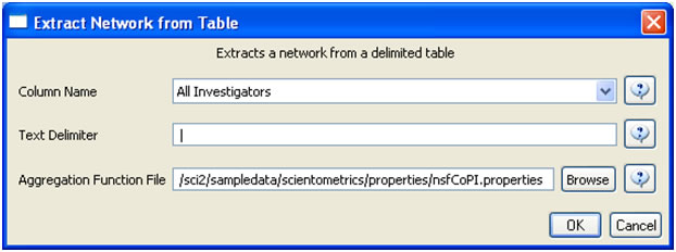
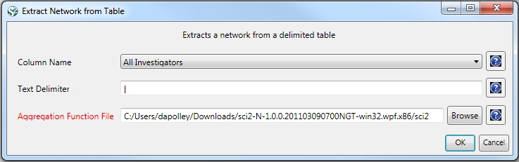
Load the NSF data using 'File > Load' and following this path: 'yoursci2directory/sampledata/scientometrics/nsf/KatyBorner.nsf' (if the file is not in the sample data directory it can be downloaded from 2.5 Sample Datasets). Make sure the loaded dataset in the Data Manager window is highlighted in blue, and run 'Data Preparation > Extract Co-Occurrence Network' using these parameters:
Aggregate Function File
Make sure to use the aggregate function file indicated in the image below. Aggregate function files can be found in sci2/sampledata/scientometrics/properties.
About NSF text delimiters:

Select the "Extracted Network on Column All Investigators" network and run 'Analysis > Networks > Network Analysis Toolkit (NAT)' to reveal that there are 13 nodes and 28 edges without isolates in the network. Click on "Extracted Network on Column All Investigators" and select 'Visualization > Networks > GUESS' to visualize the resulting Co-PI network. Select 'GEM' from the layout menu.
Load the default Co-PI visualization theme via 'Script > Run Script ...'and load 'yoursci2directory/scripts/GUESS/co-PI-nw.py'. Alternatively, use the "Graph Modifier" to customize the visualization. The resulting network in Figure 5.2 was modified using the following workflow:
- Resize Linear > Nodes > totalawardmoney > From: 5 To: 35 > Do Resize Linear
- Resize Linear > Edges > coinvestigatedawards From: 1 To: 2 > Do Resize Linear
- Colorize > Nodes > totalawardmoney From :
 To:
To:  > Do Colorize
 - Colorize > Edges > coinvestigatedawards From: To:
 > Do Colorize
 - Object: all nodes > Show Label
- Type in Interpreter:
>for n in g.nodes:
     n.strokecolor = n.color

Figure 5.2: NSF Co-PI network of Katy Börner
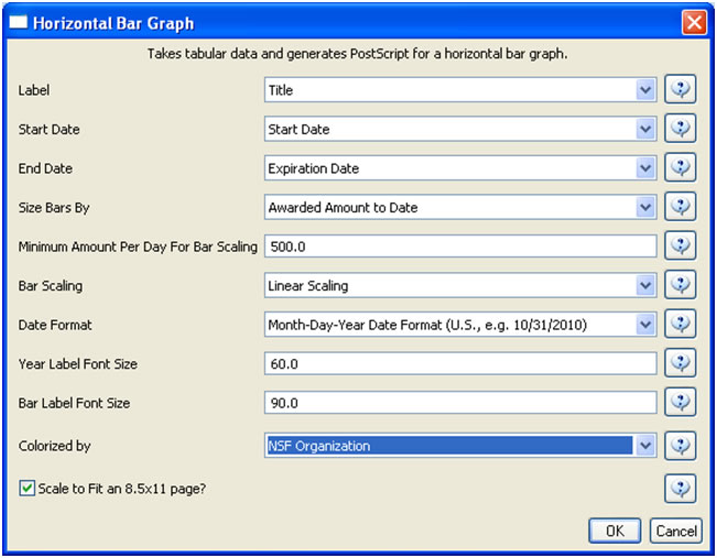
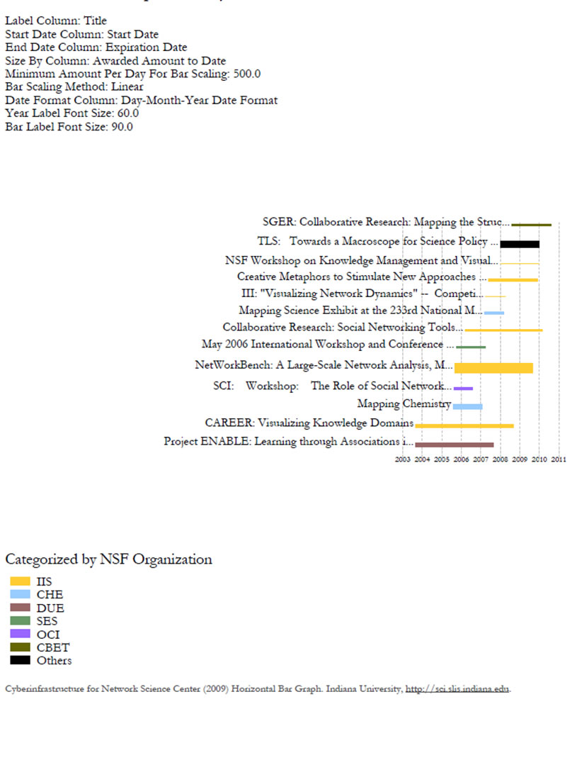
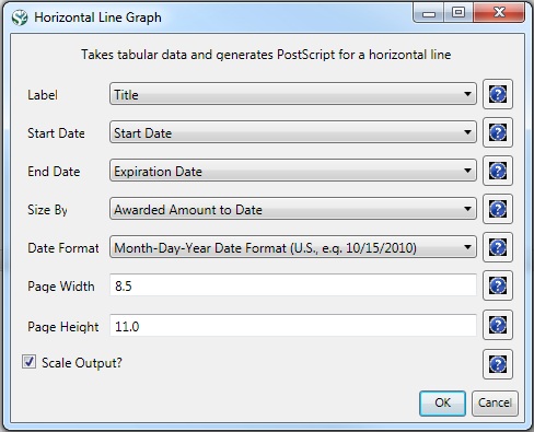
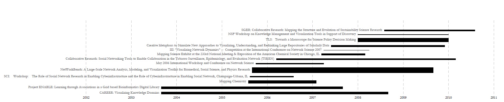
For a summary of the grants themselves, with a visual representation of their award amount, select the original 'KatyBorner.nsf' csv file in the Data Manager and run 'Visualization > Temporal > Temporal Bar Graph', entering the following parameters:

The generated postscript file "HorizontalBarGraph_KatyBorner.ps" can be viewed using Adobe Distiller or GhostViewer (see section 2.4 Saving Visualizations for Publication).

Figure 5.3: Horizontal Bar Graph of KatyBorner.nsf
To see the log file from this workflow save the 5.1.1.2 NSF log file.