| Time Frame: | 1959-2010 |
| Region(s): | United States |
|---|---|
| Topic Area(s): | Science Education |
| Analysis Type(s): | Geospatial |
For this workflow we will be visualizing National Science Foundation funding, by state, for awards with the phrase "science education" in the title. This workflow will require you to download some data from the Scholarly Database (SDB) (http://sdb.cns.iu.edu) and then use the Aggregate Data algorithm to perform some basic data aggregation to clean the data before geocoding and visualizing.
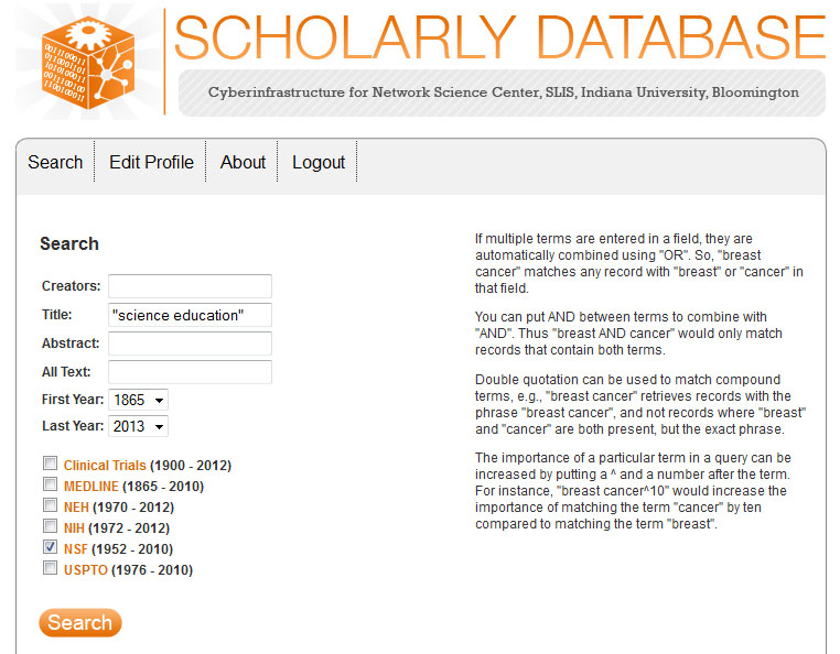
First, go to the Scholarly Database (SDB) (http://sdb.cns.iu.edu). If you are not registered for SDB you will need to do so before you can download data. Once you have completed the registration, you will be emailed a confirmation and you will be able to access the SDB search interface. In the SDB search interface, enter the search term "science education" in the title filed and make sure to select the NSF (1952 - 2010) dataset:
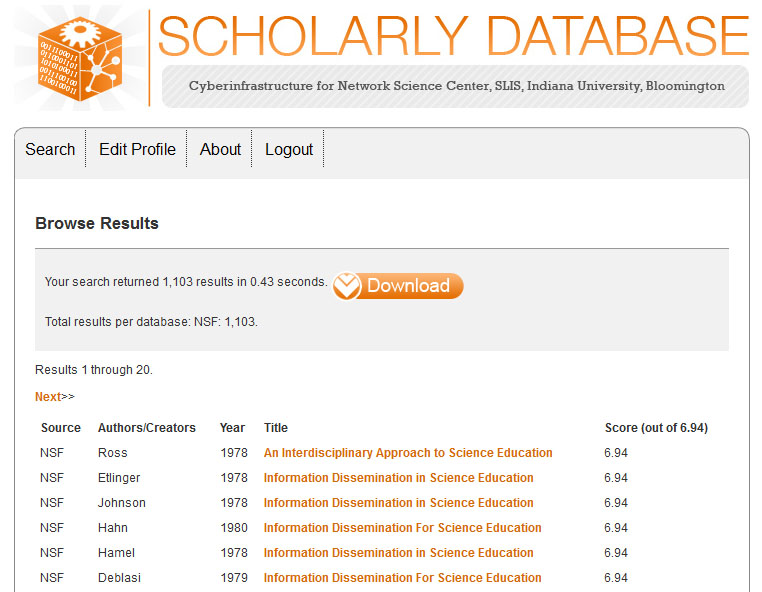
The results will be displayed as follows:
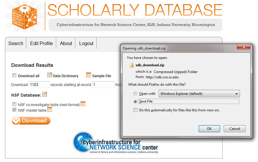
To download the results simply select download and download all 1,103 results. You can either select "Download all" or specify how many records you want to download. Here the total number of records was specified and the "NSF master table" was selected:
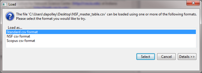
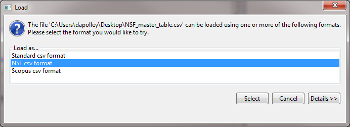
Save the zipped file somewhere on your computer where you can access it and extract the file to you desktop. Now you can load the "NSF_master_table" file into Sci2 by selecting 'File > Load' and navigating to where you have the file saved or by dragging and dropping the file into the data manager. Load the file in the standard csv format:
The NSF format has changed slightly, and if you load this file in the NSF csv format, you will not be able to view or save it out from the data manager.
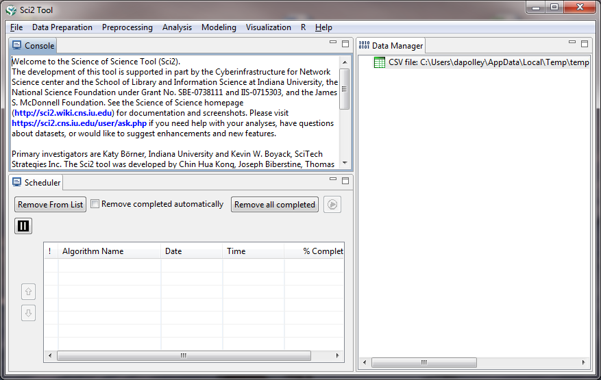
Once you have loaded the file it will appear in the data manager:
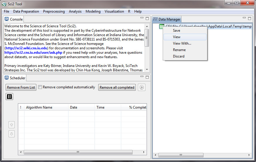
Now you need to start cleaning the data before you can run any analysis or visualization. To view the data, simply right-click on the file in the data manager and select view:
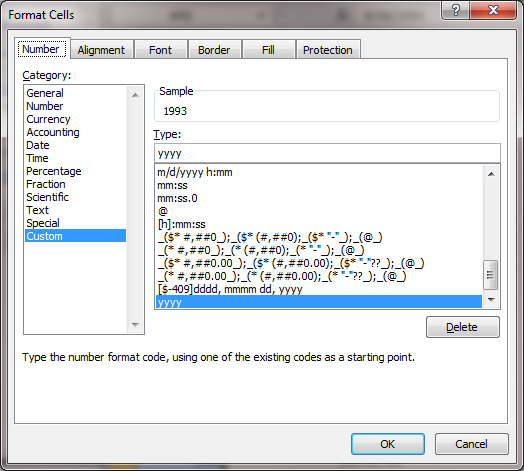
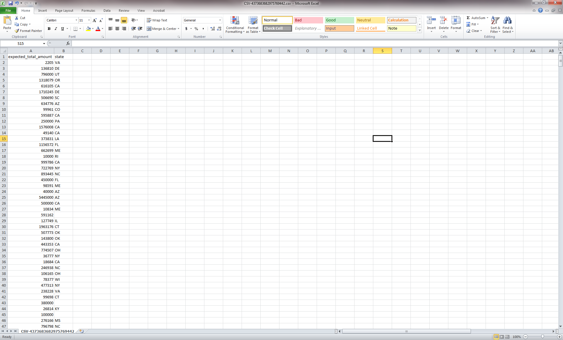
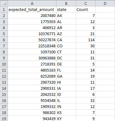
This will open the file in Excel (or the default spreadsheet program on your system). You can leave all the data, but for this particular visualization we simply want to see the amount of funding for states based on awards with the phrase "science education" in the title of the award and how current this funding is. So, to make things easier to work with, we are going to remove all the data that are not necessary for this visualization. Keep only the date_expires column, the expected_total_amount column, and the state column. You can remove all other columns from the csv file. You will need to change the date_expires column to display only as the year. Select the entire column in Excel and then right-click to format the cells. Then choose the custom option and you can format the date so that only the year appears:
After you finish editing the data in the Excel file, the result should look like this:

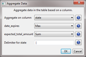
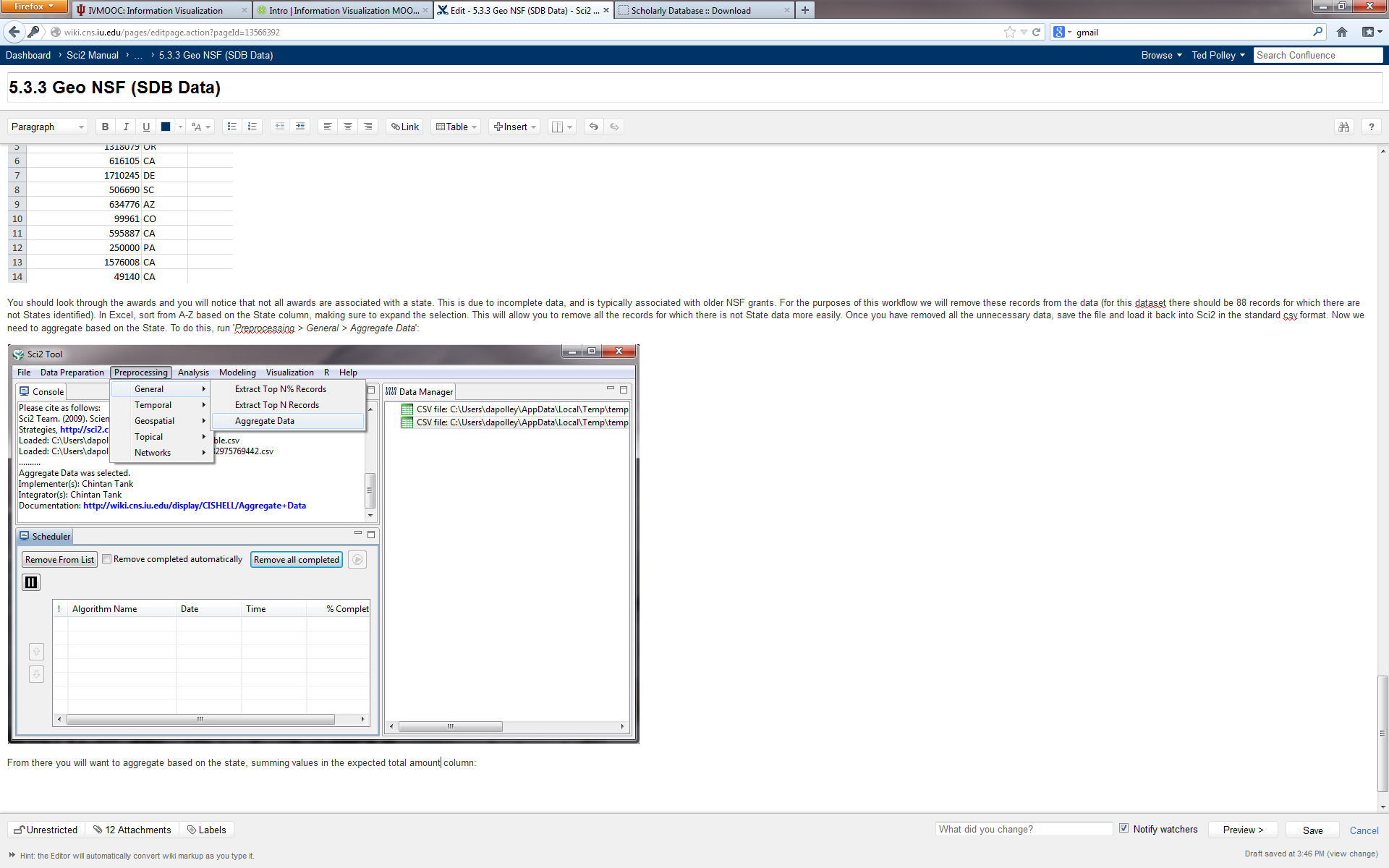
You should look through the awards and you will notice that not all awards are associated with a state. This is due to incomplete data and is typically associated with older NSF grants. For the purposes of this workflow we will remove these records from the dataset (there should be 88 records for which no state is identified). In Excel, sort from A-Z based on the state column, making sure to expand the selection. This will allow you to easily remove all the records for which there is no state data. Once you have removed all the unnecessary data, save the file and load it back into Sci2 in the standard csv format. Now we need to aggregate the data based on the state. To do this, run 'Preprocessing > General > Aggregate Data':
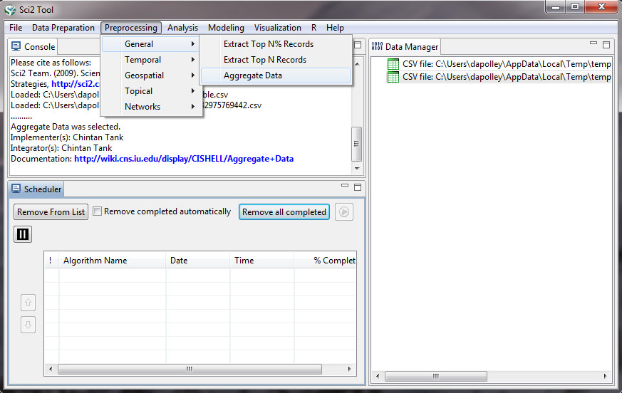
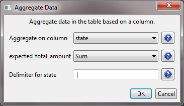
You will want to aggregate based on the state, finding the max value in the date_expires column, and summing values in the expected_total_amount column:
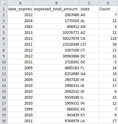
Click OK, and a new file will be generated in the data manager called "Aggregation performed using unique values in 'state' column." If you look at the data again, you will see that states have been aggregated, the date_expires column will display the most recent year an award expires for the corresponding state, the expected_total_amount for all award associated with a state have been summed, and a new column indicating how many times a state appeared in the dataset will be created under the label "Count":
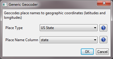
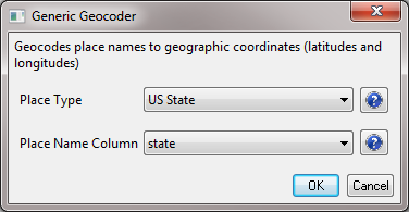
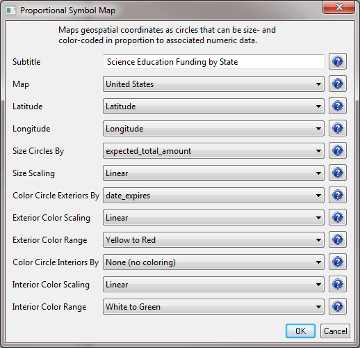
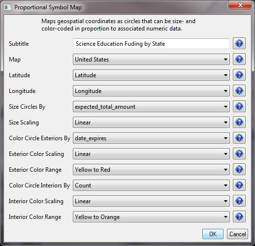
Now, select the new file in the data manager and run 'Analysis > Geospatial > Generic Geocoder' and input the following parameters:
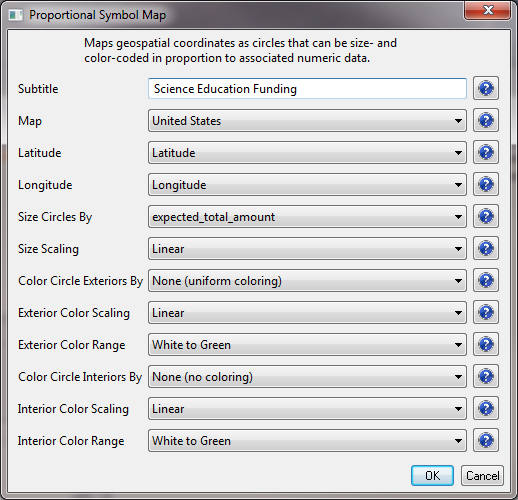
The result will be a file in the data manager that has the title "With Latitude & Longitude from state." Select this file and run 'Visualization > Geospatial >Proprtional Symbol Map' and input the following parameters:

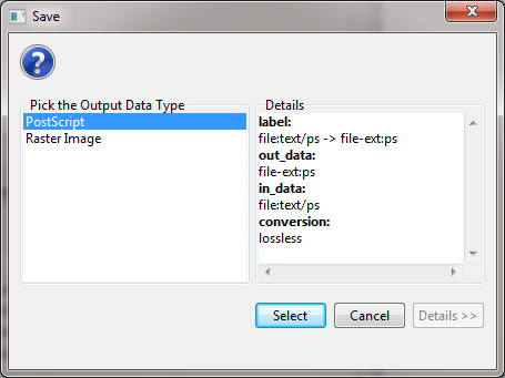
This will result in a "Geospatial Visualization (Proportional Symbol Map)" file in the data manager. You must save the file out from the data manager, by right-clicking and selecting save as. You should save the visualization as a PostScript file:
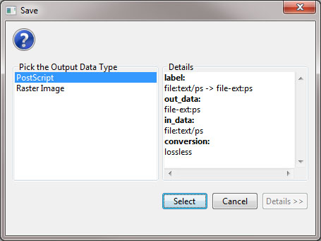
You will need to convert the PostScript file to a PDF in order to view the file. If you do not know how to convert PostScript files to PDFs, see 2.4 Saving Visualizations for Publication.
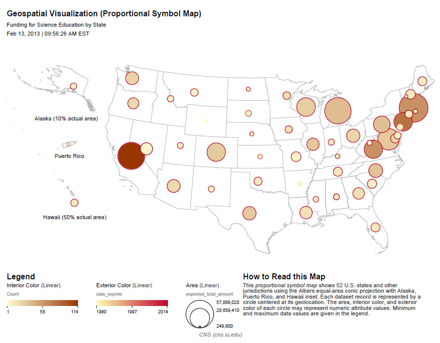
So, the resulting map should show us the level of funding in total for states based on NSF awards with the phrase "science education" in the title, and we should also be able to see when the most recent award expired, giving us a sense of the time scale for this funding. We will also be able to see how many awards there are per state, reflected by the interior color of the symbols. The resulting map should look something like this:

This visualization is obviously pretty difficult to read, particularly for the sates on the East Coast of the United States. It will require some editing in an image editor such as Adobe Illustrator or Inkscape, but Sci2 has provided a good foundation for the visualization. If you want to learn how to use Inkscape to edit the legend of this visualization or add labels to the symbols so they can more clearly be associated with the states to which they refer, see 2.4.2 Creating Legends for Visualizations.